


Say hello to the new Self-Service Portal
Update: June 15th 2026
Say hello to the new Self-Service Portal
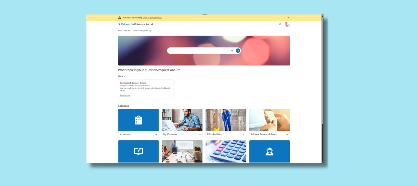
We’re excited to share that the new Self-Service Portal (new SSP) is now available for all application managers. After months of development, testing, and gathering feedback, the new SSP is ready for you to explore and ready for your employees whenever you decide to switch it on.
The new SSP was built with one clear goal: make it easier for employees to quickly find what they need.
What the new SSP is
The Self-Service Portal should be the first place that employees go when something’s wrong or when they need to request something. And with today’s expectations for modern tools, the classic SSP no longer matched how users prefer to work.
That’s why we rebuilt it from the ground up.
The new SSP brings:
- A cleaner, modern design
The interface feels lighter, clearer, and more intuitive even for users who rarely open the portal.
- Improved navigation
Instead of searching through tiles or guessing where to click, users follow a clearer, more structured flow. It’s easier to discover services, forms, and knowledge items without digging.
- A more user-friendly experience
The layout helps users focus on what matters: describing their needs and getting an answer. The new structure works better on all devices, supports accessibility improvements, and feels more like the tools people use in their day-to-day life.
- A foundation for new capabilities
Some of our upcoming AI capabilities — like AI Search — are designed to work specifically with the new SSP layout and architecture. Switching to the new SSP means you're ready for what’s coming next.
You decide when to make it available to your users
From today onward, application managers can enable the new SSP whenever it suits their organization.
The new SSP is optional at launch. You can test it quietly with a small group, and open it up for everyone when you're ready.
When you enable it as your default SSP, all classic SSP links automatically redirect, including links inside email templates. No manual updates are needed.
A smooth transition
Not all SSP components have been fully redesigned yet. That means some pages will still be redirected to the classic Self-Service Portal. This is intentional and important:
- Users never hit a dead end
- All workflows stay functional
- You can adopt the new SSP gradually, without risk
We’ll keep releasing improvements from now on until the entire flow is ready to stand on its own.
How to get started
You can enable the new SSP right now. Documentation and setup guidance will continue to expand over the coming updates.
What do you think?
Have you already enabled the new SSP in your environment? How are your users responding to the refreshed design and improved navigation? Share your experiences below!
FAQ
As we see a lot of similar questions about the new SSP we try to answer them all at the same time in this FAQ.
Am I forced to switch?
No. Switching is optional, your current setup stays in place, and you can move back to the old portal at any time.
What happens to my existing links when I switch?
When you enable the new SSP as your default, all classic SSP links redirect automatically, including links in email templates. No manual updates needed.
Note: some pages (such as reservations management) will still temporarily redirect to the classic SSP while the migration is in progress. Users will never hit a dead end.
What do I actually gain right now?
For your end users: a faster, clearer portal prominent search, quick links up top, and a clearer services overview. From the Engaged package onwards, this also unlocks access to AI Search.
Why is customization more limited, and how do I handle images in the new SSP?
We chose to release the new SSP early and in parts so you get new features sooner. The SSP Designer still runs on the older version, so options for adjusting layout, tile sizes, and branding are more limited today expanding it is something we're working on.
In the meantime, images behave differently in the new SSP: they're responsive and cropped rather than scaled, so images from your old setup may not transfer cleanly. The recommended sizes are 300×200 or 200×200 px for tiles and 2784×480 px for banners (keep essential content centered, as edges may crop on smaller screens). Knowledge item KI 19224 has the full details.
Before switching, we recommend reviewing the Update Guide — it helps you assess whether the new SSP already fits your organization's needs.
Does my feedback go anywhere?
Yes, it's directly setting the order of what we build next. Submit via the feedback button inside the new SSP, or via TIP.