


A fresher look for TOPdesk's operator environment
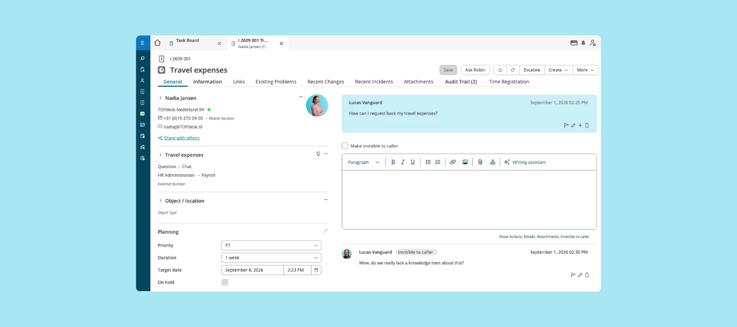
TOPdesk is getting a more current look, without asking you to relearn how you work.
What's new
We're updating the navigation and the screens operators use every day: new fonts, icons, colours, shapes and sizes. Older screens are now fully in line with the newer parts of the product, so the whole environment looks consistent. Colour is used deliberately, to pull your eye to what needs attention right now, and quiet down everything else.
What's not changing
This is a visual refresh only. No new features, no workflow changes, no bug fixes, nothing moves. Everything you know how to do today, you'll still do the same way. It will just look sharper.
Who it's for
Every TOPdesk customer, on every plan.
How to get started
The refreshed look arrives in October. There's nothing to set up, it simply appears in your environment. We'll email you two weeks before it reaches your production environment. If you have a test environment, that's where it lands first, on the day we send the email, giving you the full two weeks to get familiar with it before it goes live in production.
Want get more information, you can go to KI 19461 to read about the FAQs.
What do you think?
What would you like TOP desk's look and feel to catch up on next? We're curious what stands out to you once it's live.